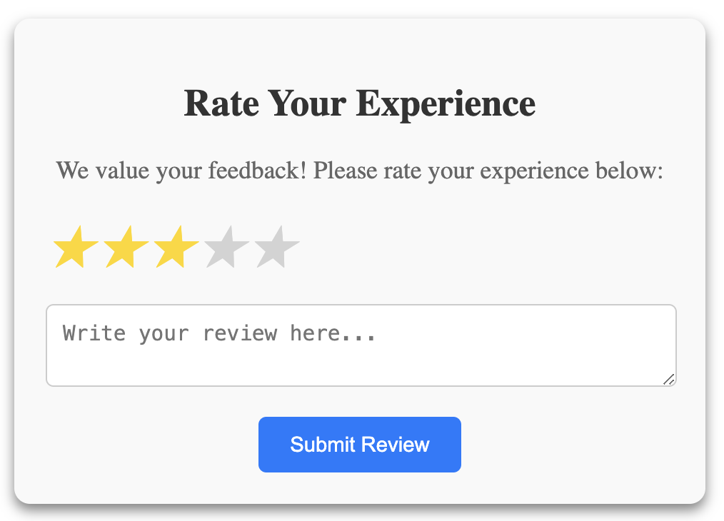
When preparing for frontend interviews, implementing common UI elements like a Star Rating Component is a frequent question. In this article, we will walk you through building a customizable star rating component with hover and click interactions in ReactJS.
What is a Star Rating Component?
A star rating component allows users to rate items (e.g., products, movies) using a set number of stars. You can typically hover to preview the rating and click to set it. Our component will provide:
- Dynamic Hovering: Highlight stars based on the user’s current hover position.
- Clickable Ratings: Allow users to select a rating.
- Customizability: Control the number of stars and manage user input.

import React, { useState } from "react";
import "./StarRating.css";

const StarRating = ({ totalStars = 5 }) => {
  const [rating, setRating] = useState(0);
  const [hover, setHover] = useState(null);
  console.log(Array(totalStars), "Array(totalStars)");

  return (
    <div className="star-rating">
      {[...Array(totalStars)].map((star, index) => {
        const ratingValue = index + 1;

        return (
          <span
            key={index}
            className={`fa-star ${
              ratingValue <= (hover || rating) ? "filled" : ""
            }`}
            onClick={() => setRating(ratingValue)}
            onMouseEnter={() => setHover(ratingValue)}
            onMouseLeave={() => setHover(null)}
          >
            ★
          </span>
        );
      })}
    </div>
  );
};

export default StarRating;
/* StarRating.css */
.star-rating {
display: flex;
cursor: pointer;
}
.star-rating .fa-star {
font-size: 2rem;
color: lightgray;
transition: color 200ms;
}
.star-rating .fa-star.filled {
color: gold;
}Explanation:
- We use the
useStatehook to manage the current rating (rating) and the hover state (hover). - The
map()function dynamically renders stars based on thetotalStarsprop. - Each star is clickable (
onClick), highlights on hover (onMouseEnter), and resets when the mouse leaves (onMouseLeave).
Enhancements:
- We can add
onRatingChangeprop which allows parent components to handle the selected rating. - We can add
aria-label,aria-pressed, androle="button"to ensure that the component is accessible. - We can add
tabIndexattribute allows keyboard users to navigate the rating options.
